[created with fondant, cocoa butter, dusting colours, lustre, 24ct gold leaf, silver leaf, royal icing, chocolate, petal paste]
The Dorchester’s iconic Gold Room was our starting point. The Quintessentially Wedding Atelier was the occasion. Of all the spaces and events to design a wedding cake for, this was an exquisitely beautiful challenge!
The Client:
When creating a custom cake, we always start with the client. We wanted to hear the story being created by the event, and were mindful of the architectural uniqueness and history of the setting.
Site visits:
As our cake would be one of the first things guests would see, the quest was for a feature cake to set the scene and expectations for the level of craftsmanship and service offered by invited suppliers. Elegance and presence were the watchwords, with a specific request for a non-white cake.
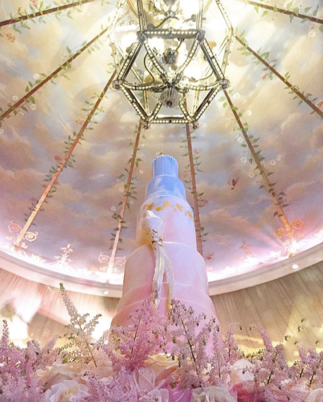
Our second site visit was to discover The Dorchester’s requirements and to take additional video and photos for reference. We were invited to create a wedding cake that reflected the unique features of the Gold Room in terms of colour, motifs and the unique 1930’s architecture. Also desirable was the wish that guests’ eyes be drawn upwards toward the crystal birds of paradise sitting in the lantern chandelier and the incredible hand painted ceiling of the Gold Room above.
It was at this point that we heard the story of the birds, which had originally been taxidermy birds of paradise, but had been replaced (much to the consternation of some regular guests) with more politically correct, and far more sparkly, crystal birds.
The antique golden chinoiserie doors just outside the Gold Room, and the flights of birds soaring above in the vaulted ceiling reinforced the importance of birds of paradise as a prominent motif.
Flavours:
As this cake was not to be eaten at the event, but created to display of our design skill and artistry, the flavours of the 1,800 cake canapés provided to guests was at our discretion. We chose to bring; a gently spiced carrot cake with cream cheese buttercream, a cherry & almond cake with Amaretto laced buttercream, and a deep chocolate cake with chocolate buttercream.
Design:
Focusing in on the notes, video and images captured, we first went to work researching the space. Finding that Alex Kravetz Design had renovated the Gold Room a few years earlier, we contacted their London team and requested their archives, press releases and quizzed them on the importance of motif’s, marks and colours. They were extraordinarily helpful and even sent across the original mood boards for us to consider. The alcoves were often referred to as the key feature of the architecture, and as such we knew we would need to somehow represent them in cake.
Then, the lantern. Knowing the importance of the lamp in the otherwise light-less room, we got on the phone to Austria where the lantern was originally designed and built. The designer at Lights of Austria was fantastic, sending across the in-process shots of the crystal birds being created (one of whom they had lovingly named Polly!).
The process:
For some weeks we investigated the possibility of recreating the birds in sugar crystals. We consulted sugar experts, talked to other pastry chefs, bought a variety of specialist sugar and trialed about five different sealing options. Sugar is notoriously pesky in that it wants to constantly draw in moisture which causes it to cloud over time. As the date of the event loomed closer, the sugar beat us, and the crystal option was finally, and very sadly, discounted.
We turned to chocolate (no bad thing in our books!), and Phil (our sculptor) recreated two birds of paradise in chocolate, cocoa butter and gold leaf.
The rest of the cake we knew had to draw the eye upward, and reference the era of the hotel. Knowing that The Dorchester was opened in 1932, when both the Empire State Building and the Chrysler Building were finished, we chose to echo the striking silhouettes of 1930’s New York skyline in nine tiers.
The colours of the room just happened to be Pantone’s colours of 2016, serenity (blue) and blush pink. Aiming to marry the two colours in a soft ethereal dance, we hand-painted the lower portion in blush (the predominant colour of the carpet), and blended it as it rose upward to meet the serene blue of the vaulted ceiling. At the point of meeting, the cake was encircled with a broken abstract line of silver and gold leaf.
Piped on the top tier was a reflection of the caged vaulted ceiling, with the sixteen intersecting circles on the lantern’s ceiling rose reproduced on the cake board at the base. In each circle, a mini cake (encircled in gold and silver leaf), sat nestled into its own alcove, mirroring the rhythmic architecture of the space.
Flowers:
For such a large cake, a cake stand would make sense… but flowers…!
We met Helen Edwards of The Velvet Daisy a year before this event, and were captivated by her flower-full, naturally elegant arrangements, (and her love, knowledge and passion about all things that grow). It was so easy to share our ideas and designs with her. Helen was so helpful in teasing out exactly what we wanted the final look to be, and delivered incredible work, with quality rose blooms in perfect shades that made the whole process a breathtaking delight.
Her attention to detail was impeccable, and her sense of colour and feel just perfect. The white and pink Astilbe she added at the finish enhanced the overall look with a stunning natural femininity.
Photos:
With such low light in the room we struggled to capture the colour nuances of both the cake and flowers, but were helped by the talents of John Nassari, official photographer, and the creativity of Nathan Rollinson, who captured an amazing vantage point on his phone!
The event itself was a fantastic experience, and we met industry professionals with whom we now work closely. In terms of the cake, it went on to live a little longer in the window of Ruth Kaye Designs in Primrose Hill to support her beautiful range of pink ombre stationery. It was subsequently re designed, re-covered and redecorated in June in collaboration with Ruth Kaye Designs, to co-ordinate with a smart new white and silver range of her stationery.
With thanks to: